Adobe · Adobe Community

One discovery model for 100+ Adobe communities.

I led design strategy to unify search, discovery, and personalized feeds for 1.9M monthly active users. It shipped to every community, and the old design was retired.

Results

  • Clarity of purpose

    +28% Search success rate

  • Authenticity and safety

    +20% Return-visit rate

  • Growth

    +25% Average session depth

  • Growth

    +16% User engagement

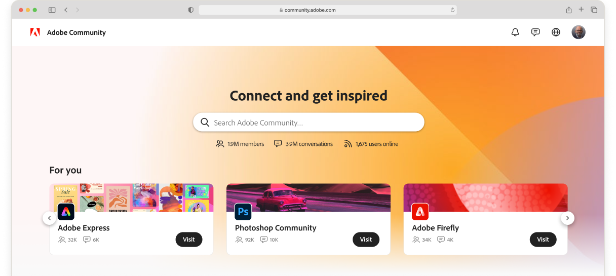
The redesigned Adobe Community explore page in a browser window: a “Connect and get inspired” search hero with member, conversation, and online counts, and For you cards for Adobe Express, Photoshop Community, and Adobe Firefly.
Role
Lead Product Designer, owned design strategy
Team
4 designers · 2 PMs · 6 engineers · content strategy · ML · design research
Scope
100+ communities · 1.9M monthly active users
Timeline
12 months, MVP → post-MVP

Context

Adobe Community was built for answers, not discovery.

BeforeAdobe Community before the redesign
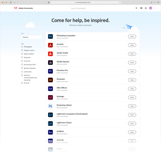
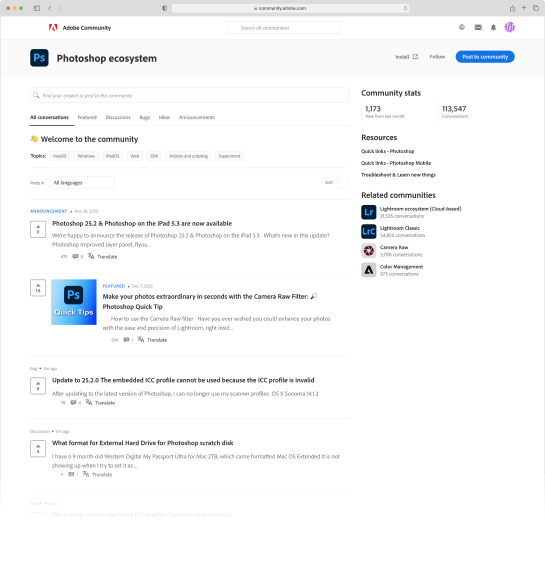
The original Adobe Community home page: a “Come for help, be inspired.” banner above one long list of product communities. The original Photoshop community page: a text-heavy list of discussion threads under tabs, with community stats in a sidebar.
  • User

    Hard to find

    People couldn’t quickly find relevant, trustworthy content, and few knew the community existed.

  • Business

    1.9M

    monthly active users across 100+ communities, driving adoption, retention, and support deflection.

  • Why

    Answers only

    It was built as a support forum for getting answers. It was never designed for discovery.

Strategy

Four research-backed needs, and the design lever each one drove.

  • Clarity of purpose

    Search success +28%

    Discover communities and search, up front.

    People need to know what a community is for.

  • Authenticity and safety

    Week-5 return visits +20%

    Guidelines, visible moderators, and trust signals.

    People feel safe before they feel authentic.

  • Growth

    Engagement +16% · Session depth +25%

    A feed with previews, and post pages with a Back control.

    Learning is the top value; app-connected content sets Adobe apart.

  • Quality connections

    Signal: first-time posts

    Create-a-post, profile cards, and social proof.

    People want discussion, critique, and early rapport.

Evidence: research on the original community (90-person survey, 15 interviews, and usability testing, 2022), Jobs-to-be-Done audit, 24-community audit.

MVP principle: every feature either removed friction or doubled as a measurement instrument, so post-MVP investment followed evidence.

Solution

Each research need, answered on the screen

  • Clarity of purpose
  • Authenticity and safety
  • Growth
  • Quality connections

Explore page

Explore page with numbered callouts 1 to 4 on the universal search, the community cards, the topic chips, and the feed cards with visual previews.
  1. 1. Universal search up front

    Because support questions are specific and urgent, and leading forums put search first.

  2. 2. Discover communities as visual cards

    Because the original list showed only 7–8 communities above the fold.

  3. 3. Topic chips to browse by interest

    Because testers found the topics filter useful but almost invisible.

  4. 4. Feed card: avatar, name, visual preview

    Because testers couldn’t judge a post without opening it, and asked for thumbnails.

Community page

Adobe Express community page with callouts 5 to 7 on the About this community and moderators panel, the Create a post prompt, and an author profile card shown on hover.
  1. 5. About this community and moderators

    Because people need to feel safe before they feel authentic, and want guidelines and moderators seen early.

  2. 6. Create-a-post prompt

    Because people saw it as a one-way channel, and research shows they want discussion and early rapport.

  3. 7. Author profile card on hover

    Because users couldn’t tell whom to trust.

Post page

Post page with callout 8 on the Back control at the top left, next to the post body, media, comments, and a sidebar of related posts.
  1. 8. Back returns you to your place in the feed

    Because breadcrumbs dropped people on a category list, and people browsing a feed want to return to the same spot, with scroll and filters intact.

System

One content model behind every community page

Every community page is built from the same model, so one change improves all 100+ of them.

Replaced everywhere:
Text-only post list → Feed card · Breadcrumb post page → Post page with Back · Long community list → Community cards

01 · Foundation

  • post
  • author
  • topic
  • trust signals

Content model

One schema for posts, authors, topics, and trust signals.

renders

02 · Surface

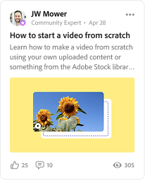
Feed card: JW Mower, Community Expert, “How to start a video from scratch”, with a sunflower image preview and like, comment, and view counts.

Feed card

Scannable preview: avatar, name, role, visual, and counts.

opens

03 · Interaction

Miniature post page: the post with media and comments on the left, and the community sidebar with related posts on the right.

Post page

Its own page and URL; Back returns you to your place in the feed.

reveals

04 · Trust

Profile card: JW Mower, Community Expert, Daly City, CA, with a Following button and 54K followers, 468 following, 5K solved, and 12K replies.

Profile card

Who is behind a post, and why to trust them.

What stays constant

  • Content model fields and trust signals
  • Role badges and counts on every card
  • Back returns people to their feed position
  • Accessibility and focus behavior (WCAG Level A)

What varies by community

  • Imagery and aspect ratios
  • “What you’ll need” tools (for example Express, Stock)
  • Topic labels
  • Community-based challenges

Influence

Breadcrumbs or a Back button?

+25%

average session depth

After Back by default, with the community name as a tag

The tension

Engineering wanted the five-level breadcrumb because it fit the platform. But people lost their place after opening a post.

How I moved it

  • Showed recordings of people losing their place.
  • Showed the polyhierarchy problem: one Photography thread lives under both Photoshop and Lightroom.

The argument

The case for a Back button

Posts always had their own page and URL. What changed is the way back: from a five-level breadcrumb that dropped people on a category list, to a Back control that returns them to the feed exactly where they left it.

Before: Breadcrumbs
The old post page, with a five-level breadcrumb trail (Home › App communities › Photoshop › Questions › post title) above a text-only question.
After: Back, same place
The new post page, with the Back control circled at the top left and a callout reading “Back returns you to the same place in the feed”.

Trade-off: Back hides the hierarchy that breadcrumbs showed, so the community name stays as a tag in the header.

Reflection

What I took away.

  • Evidence beats convention.

    Recordings and the polyhierarchy argument moved engineering from breadcrumbs to Back.

  • Design the model, not the page.

    I owned the discovery strategy. One content model meant one change improved all 100+ communities.

  • Ship to learn.

    Every MVP feature removed friction or measured something, so post-MVP investment followed evidence.