Analytics
3 in 5
of misinformation returns came from customers misjudging size and scale
Worst on sofas, beds, and large furniture, the pieces hardest to picture at home.
West Elm · Double Dare
Beat the 10% relative target on custom furniture in 12 months by showing customers exactly what they were buying at the moment of commitment. Shipped incrementally around a payment-partner constraint, then adopted across Williams-Sonoma brands.

Context
of online sales come back as returns
Nearly 3 in 10 online sales
of custom-order returns trace to missing or unclear information
About 1 in 5 custom-order returns
Research
3 in 5
of misinformation returns came from customers misjudging size and scale
Worst on sofas, beds, and large furniture, the pieces hardest to picture at home.
Customers who returned items described the same gap: no guidance from discovery to purchase.
“Found it difficult to locate overall dimensions.”
“Lack of communication on how to avoid issues leading to returns.”
“No clue how to anticipate and prepare for delivery, and no guide to do so.”
I ordered a custom piece end to end to see what customers saw. I’d been that customer myself.
Alignment
Doing
Checks the sofa’s measurements against their living room.
Needs
To know it fits through doors, hallways, and elevators.
Measuring guide
Doing
Picks fabric, color, and size, reviews the summary, adds to cart.
Needs
Full dimensions of their exact configuration, and a final-sale reminder before committing.
Dimension details · Custom-order reminder
Doing
Sees the item in the cart.
Pain point
Hits “This made-to-order item cannot be canceled or returned” with no way to check. At this price, they hesitate.
Biggest drop in confidence
Doing
Heads to checkout.
Needs
A light final check of fabric, size, and delivery prep before paying.
Verify & confirm overlay
Doing
Gets shipping, tracking, and delivery-prep emails.

01 · Product page
After customers select every product option, they can click a link to see the complete dimensions of their chosen configuration.
View the prototype for dimension details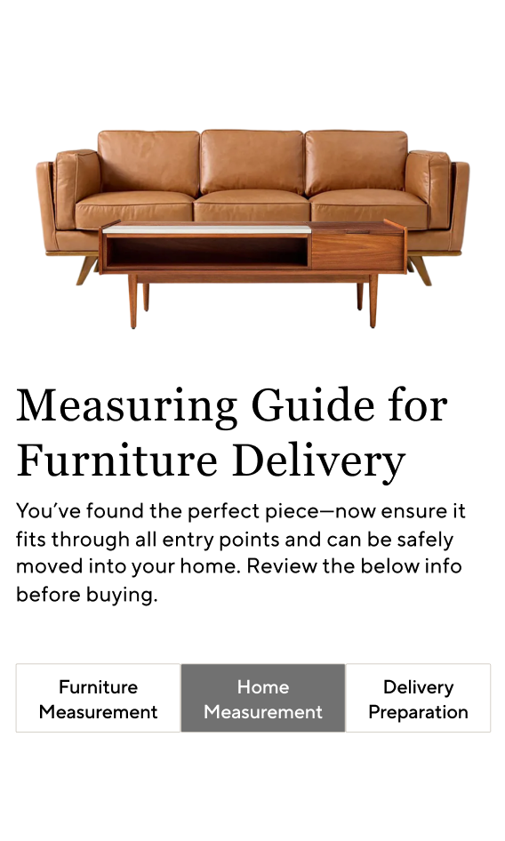
02 · Product page
An easy-to-access guide that helps customers know what to expect and prepare for delivery.
View the prototype for measuring guide
03 · Product page
Customers are repeatedly informed throughout the purchasing process that orders cannot be canceled or returned.
Trade-offs

The original plan · Cart
A step-by-step check of dimensions and delivery prep in the cart: the last chance to catch a mistake.
Blocked by the payment-partner contract
The engineering lead flagged that an overlay in the cart would breach our PayPal contract, so I proposed moving the verify and confirm overlay to the product page.
I tested two versions: a required checkbox and a gentle reminder. We pulled the checkbox early after a significant drop in add-to-cart, and the gentle reminder won.

Approach 1 · Product page
Forces a confirmation before add-to-cart completes.
Pulled early: add-to-cart dropped
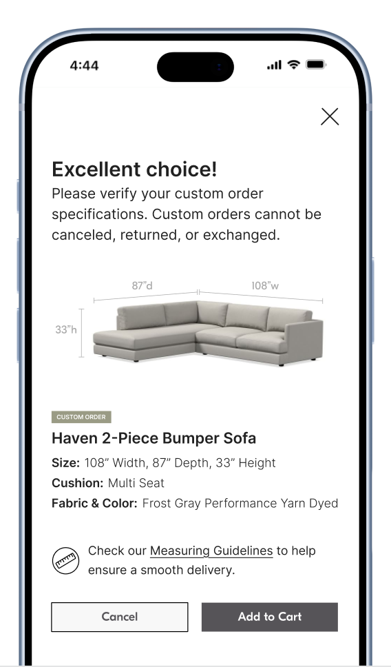
Approach 2 · Product page
A light reminder before add-to-cart, with no forced step.
Won the test
The rearranged plan: Release 1 needed no new interruption, so it could ship while we tested whether the overlay hurt add-to-cart.
Dimension details, the measuring guide, and custom-order reminders on the product page.
−5% misinformation returns in the first 6 months
The gentle overlay on the product page, before add-to-cart completes, with guidance repeated on order confirmation.
−13% by month 12 · add-to-cart ±1% in a 6-week A/B test
Outcomes
13%
fewer misinformation returns
Relative reduction · custom-order furniture
Scaled across brands
Adopted by Pottery Barn and other Williams-Sonoma brands, then added to the design system.
Reflection
We pulled the checkbox early when add-to-cart dropped.
A contract blocked our best idea. Letting go of it kept us shipping.
I now map platform and contract limits alongside the experience map.